

Foreword
Technical analysis is a trading framework used to evaluate investments and identify entry/exit opportunities in the market. This methodology uses statistical trends gathered from trading activity and specific metrics such as price movement, momentum, and volume. Moving Average Convergence Divergence (MACD) is a brilliant oscillating indicator useful in extracting relevant information from trends in stock price changes.
 “Entry and exit points are vital parts of trading and investing. That is worth repeating. Entry and Exit points are vital parts of Trading and Investing. Whether you are Day Trading, Swing Trading, or are a Long Term Investor. Why would you ever buy a stock at the wrong time? Unfortunately, there are many market participants with no training that do it every day.” - Fred McAllen, Charting and Technical Analysis
Definition
The Moving Average Convergence Divergence is a trend-following momentum oscillator that quantifies the relationship between the moving averages of a security's price. This particular tool is a lagging indicator meaning its value moves/changes after the market price is established for a given time period. It is especially useful in measuring the direction, magnitude, and rate of change of stock prices. More specifically it is derived from the difference between the “long” 26-period Exponential Moving Average(EMA) and the “short” 12-period EMA.
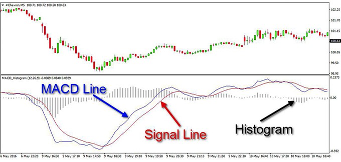
Simply, MACD line = 26 period EMA - 12-period EMA. The MACD is comprised of two distinct lines and a histogram as depicted above.
Analysts at Speed Trader clarify that: “As you see the MACD trading tool consists of a couple of lines and a histogram. Many stock traders confuse the two lines with ordinary Moving Averages, which smooth the general price action. This is absolutely incorrect. Yes, the two lines are Moving Averages but not of the price action.”
The MACD line itself is also called the “faster” line. On any stock charting software a “signal” line, aka the “slower” line, represents the EMA calculations of the MACD itself. Its shorter period of 9 days (as opposed to 12-day or 26-day periods) enables this line to average or “smoothen out” the constant upward and downward breaks of the MACD line. In essence: Signal line = 9-day EMA of the MACD line. The MACD histogram is a simple illustration of the difference between the “faster” and “slower” lines. If the MACD is below its signal (“slower”) line, the histogram will be below the MACD’s baseline. Traders typically use the MACD’s histogram to identify when bullish or bearish momentum is high.
On charting software, the MACD is set up in the notational form of MACD(a,b,c), with the letter denoting time periods of days. The first two variables, a and b represent the two lines of the MACD indicator (shown as blue above). The two time periods are subtracted from each other to derive the MACD series. Lastly, the variable c represents the time period of the ”slower” line.
Significance
According to Day Trading’s breakdown of the relationship between the two EMA indicators:
Convergence relates to the two moving averages coming together. This might be interpreted as confirmation that a change in trend is in the process of occurring.
Divergence can have two meanings. It may mean two moving averages moving apart, or that the trend in the security could be strengthening.
When compared to a graph of stock price changes there are many things a convergence and divergence of the two EMAs, quantified by the MCAD Line, can tell us.
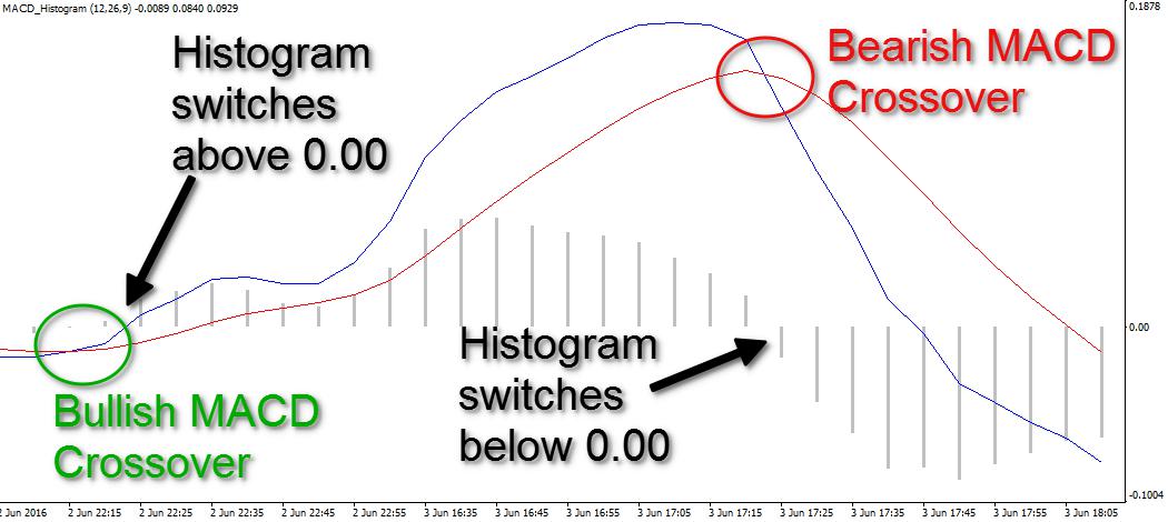
Signals of a change in a securities can be interpreted from the various cases of crossovers between the indicators of the MACD. Signal line crossovers occur when the MACD line crosses the signal line. This is typically interpreted as a situation for the security or index to accelerate in price.
Typical interpretation of the interactions of the components of the MACD are as follow:
Firstly, negative or bearish divergence occurs when the price of a security is high while the MACD line is declining. Often, this could be an indicator that a price is on the verge of falling. Should the MACD line cross downward over the signal line, this is also considered a bearish signal. This is easily tracked by the MACD histogram. A bearish signal is somewhat confirmed when the histogram goes from positive to negative.
Alternatively, positive or bullish divergence occurs when the prices are low while the MACD line has a positive rate of change. If the MACD line crosses upward over the signal line, this can be considered a bullish signal. A bullish signal is similarly confirmed when the histogram goes from negative to positive.
This trading indicator is best used to understand how the historical volatility of a security can affect its price changes in the future. Check out this case study of stock “-zgrs-” from the Shanghai Stock Market for the period of November 2, 2015, to September 21, 2017. Researchers Jian Wang and Junseok Kim of Korea University’s Department of Mathematics study the accuracy of using MACD to determine buy and sell signals based on a stock’s past performance, as well as provide more detailed considerations for trading with this graphic tool.
It is also worth noting that the default time frames of 26 and 12 day periods were established to track trends over a past month and a two-week period respectively. Many traders do adjust the periods at their discretion, but these time periods nevertheless serve as guidelines for simple effective analysis of long term trends with this tool, especially for novice traders. Furthermore, by combining the insights gained from the MACD with those gained from the Relative Strength Index of a security, one can more accurately predict imminent price reversals and make informed decisions as to when to buy or sell.
Limitations
In order to effectively use a MACD, one must first have a basic appreciation for SMAs and EMAs. To further your understanding of the price averages and simple arithmetic acrobatics at the core of the MACD’s calculations check out our blog posts on both. This particular tool is very diverse in the kind of signals that can be acquired from studying its changes over time. It therefore serves as a robust means of understanding the price behaviour of a stock.
The main limitation of MACD indicator is its subjectivity to the user. As previously mentioned, the periods of calculations can be changed for the three average calculations. With greater trading experience comes a better sense of how to change the periods in relation to one another to elicit more specific buy/sell indicators.
Furthermore, as a purely technical indicator, based on averages and their changes in relation to one another, this tool must be used with counterparts to get a fuller picture of a market. It is also a lagging indicator, meaning that it tends to be late in giving signals. A common counterpart is the Relative Strength Index. The pairing of the MACD with a leading indicator like the RSI delivers a more complete story of a stock's past and anticipated performance. The two complement one another well as RSI conclusively tells you if a stock is currently in an overbought or oversold state and the MACD tells you more about its long-term stability.
Disclaimer
DO NOT BASE ANY INVESTMENT DECISION UPON ANY MATERIALS FOUND ON THIS WEBSITE. We are not registered as a securities broker-dealer or an investment adviser either with the U.S. Securities and Exchange Commission (the “SEC”) or with any state securities regulatory authority. We are neither licensed nor qualified to provide investment advice. We are just a group of students who diligently follow industry trends and current events, then share our own advice, which reflects our personal position in the market.